MEMENTO
A Case Study in Product Development

Methods
Project Scoping
Competitive Audit
Rapid Ideation
Remote Survey
Low-fidelity Prototyping
Style Guide Creation
Research Interviews
High-fidelity Prototyping
Usability Testing
Deliverable Presentation
Role
UX Researcher
UX Designer
UI Designer
Stakeholder Liaison
Overview
This case study showcases the process of collaborative product development for a stakeholder in a team-based environment. The stakeholder for this project came to my team and I with a simple idea, to create a new form of collaborative e-cards. This project was unique in that the product itself was largely undefined, allowing us to create and test something brand new!
Tools
Figma
Adobe Suite
Google Suite
Figjam
Zoom
Teamwork and Collaboration
I worked closely with two other UX designers on this project to help bring our stakeholder’s vision to life. The three of us collaborated on everything from style guides to stakeholder communication and final deliverable creation. Furthermore, I acted as the go-between for my team and our stakeholder, ensuring open communication and setting realistic expectations for our work.

Emma Broderick
Jonathan Fuller
Audrey Giepel
What is Memento?
Memento is the next evolution of the established e-card model. It’s a platform for creating collaborative, digital gift boxes to share letters, personalized video messages, voice notes, playlists, photos and physical gifts with loved ones during significant life events.
Watch this short video to learn more!
Opportunity Space
Our stakeholder came to us with a vision to revolutionize the way we celebrate our loved ones digitally. As a passionate climate activist, he was determined to create a product that would help eliminate paper waste and provide users with the tools to create more meaningful and long-lasting celebrations collaboratively. He saw that many e-cards on the market felt impersonal and lacked the tools to easily organize and bring people together. Additionally, he wanted to create something that felt more tasteful, and refined with the hope of monetizing through brand deals in the future.

Step One: Project Scoping
After establishing a connection with our stakeholder and ensuring that we fully understood his goals for this project, my team and I set about to creating a timeline that all three of us and the stakeholder could sign off on. We deliberated through potential methods, weighing the efficacy and effectiveness of each one. We also scheduled out our windows for prototyping, styling, and sourcing research participants. Furthermore, we determined what deliverables would be most useful to our stakeholder, finally settling on a three-phase timeline that was approved by everyone involved.
Step Two: Competitive Audit
Methodology
In order to get a firsthand sense of the current e-card market landscape, my team and I performed an in-depth competitive audit of the closest competitors to our users.
Findings
All competitors still follow the mental model of a card to make it simple for consumers
Only some competitors allow for full customization and the addition of photos and videos
Sendwish Online and Hallmark are currently the only competitors that allow for collaboration, and Sendwish Online only allows it for written messages
Step Three: Remote Survey
Methodology
To better understand our users and their needs we conducted a remote survey. We sourced 12 participants and sent them a variety of questions ranging from more broad requests for examples of celebration experiences to more detailed opinions on the specific features we could potentially include in our prototype.
Findings
83% of users had no experience with the competition and did not send e-cards
Users most enjoyed receiving handwritten notes from friends and family over both e-cards and traditional store-bought cards.
Users reported levels of fulfillment from both creating and receiving celebration in direct correlation to the amount of effort put into the project.
Step Four: Rapid Ideation
Methodology
Using the data we gathered during the research thus far, my team and I began to come up with ideas for what the product prototype might look like and how it might function. We wanted to run multiple ideas past users to see what they did and didn’t like so we decided to sketch these ideas quickly on paper before moving into more time-consuming, digital tools.
Step Five: User Interviews
Methodology
Via zoom, we conducted a series of interviews with six potential users of our product. We ran them through the various sketches we had created, explaining how the ideas would work once fully functional and gathering the insights and opinions of our interview subjects. Our goal with this step was to refine and determine which designs we would use for our prototype in Figma.

Findings
Users were overwhelmingly attracted to the box model with the assets organized inside
Users expressed a desire for some customization options but felt that too many options might be overwhelming
Users were were excited by the product and especially the collaboration tools
Step Six: Creating a Style Guide
Now that we had our target set for our first iteration of the high-fidelity prototype, we moved into Figma, starting by laying the foundational building blocks of our design so each designer would be operating in a shared aesthetic framework. We created common elements such as buttons and menus, selected color palettes and text styles. Additionally we agreed on ratios for pixel spacing and created some potential logos.
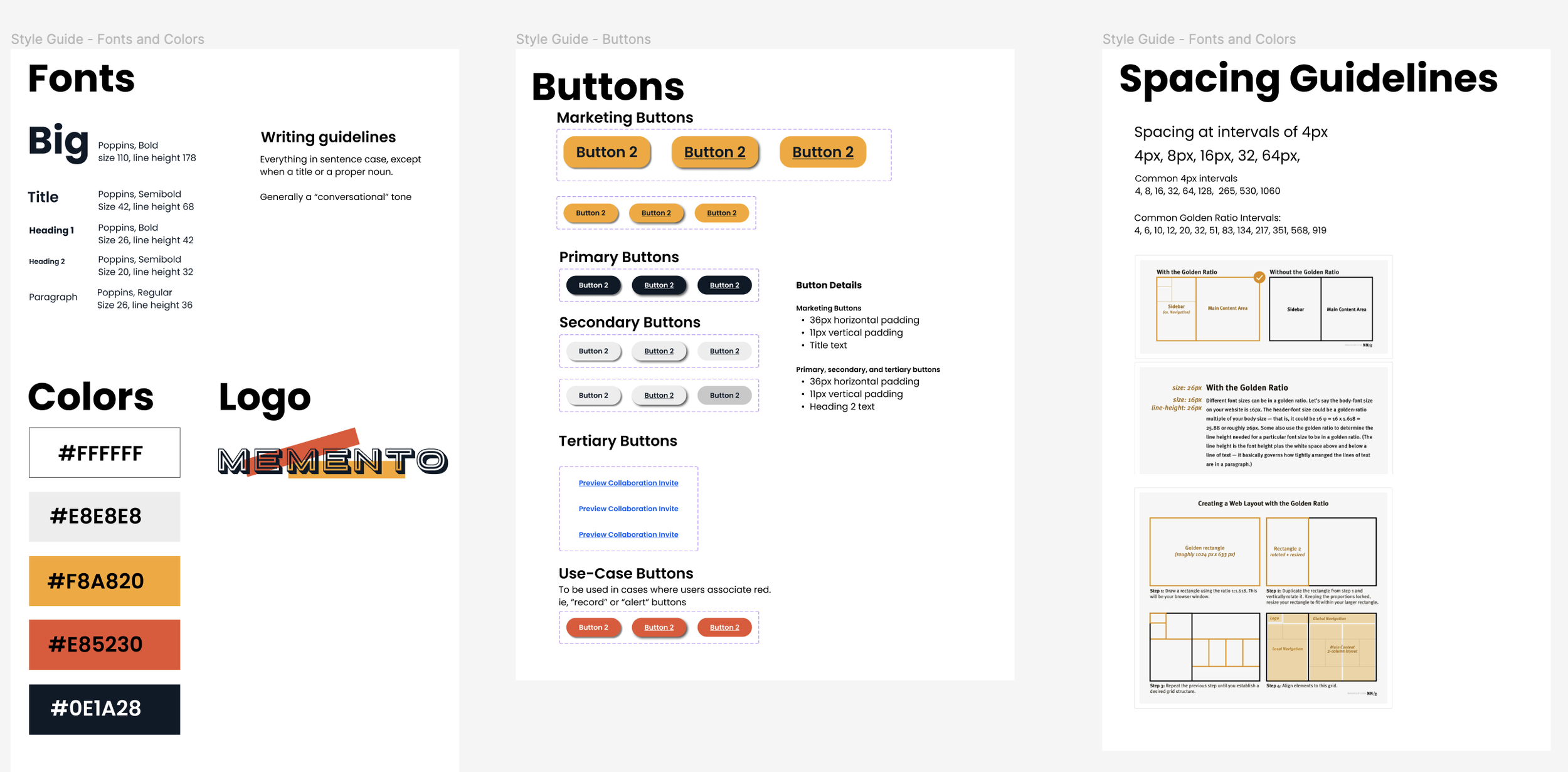
Click the image above to view the style guide!
Step Seven: Creating the Prototype
Once we had created the basic building blocks of our design, we began creating the full-fledged prototype. My role in this stage of the process relied heavily on my skills in Adobe Illustrator, Photoshop, and Premiere Pro. I was tasked with designing the box itself as well as creating an introductory video explaining the product to new users on the home page of the website. Additionally, I created the base layout for collaboration, recipient view and editing pages, assisted in the refinement of website copy, added interactivity and customization features to the box, and helped create the “hero” page at the top of the home screen.
Click the image above to view the full V1 prototype!
Prototype Highlights
Below are some key features from the Memento Prototype. Descriptions of the images are included as well. Feel free to click on the images to enlarge them!
Home Page
This landing page is the first thing that users see when coming to the memento site.
The visually simple design, with movement from the box, will engage users, and encourage them to keep exploring.
The learn more button scrolls them down the page to view the explanatory video.
This design was changed after usability tests, but follows design principles that have been proven successful.
Home Page Examples
For users who want to keep exploring and fully understand the product, the preview buttons lead to example pages of the recipient view of the box. These are important so that the user can fully visualize what the product is.
The “Start building your box!” section was made larger after usability testing, so that users can’t miss it, and clearly see the “Get started” button.
Having the “Get started” at the bottom and the top is important, so that no matter where they decide to commit to the product, the user doesn’t have to scroll too far to find it.
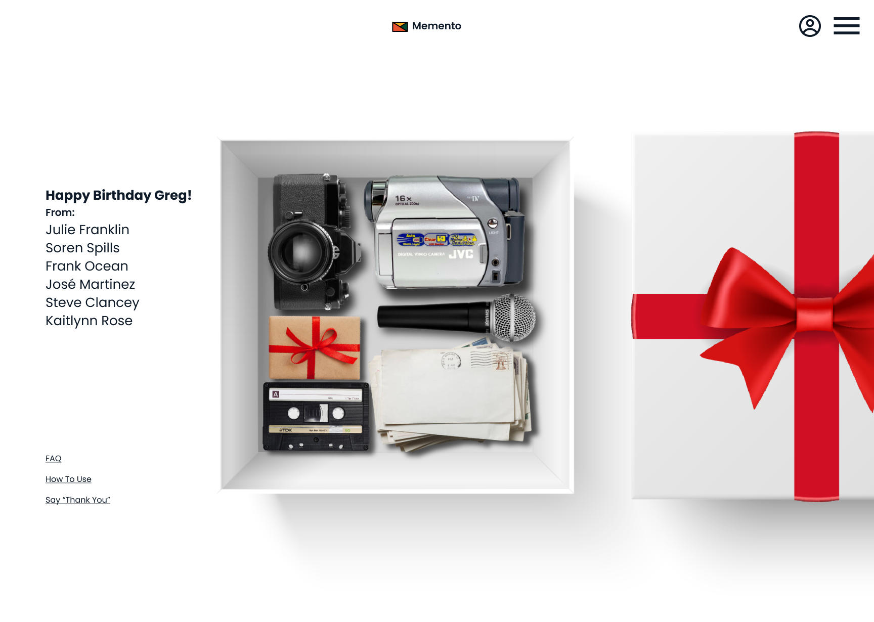
Recipient View
Titled is the Occasion and who it is for and a list of who it is from underneath.
The “How to Use” link to gives instructions and background on the box.
A delayed “Click to open” arrow pops up to help users that may not intuitively discover how to get inside.
Bolded is the “Thank You” link. Our user data showed a high motivation for senders of gifts is the recipients positive reaction. All users wanted the ability to thank senders.
Home Page Product Summary
these sections provide clear lists of the features that come with a Memento Box, as well as a clear explanation of pricing.
All the users in the usability test mentioned the transparent and clear pricing was something they appreciated, so they didn’t need to commit too far to a product before knowing how much it would cost.
Some users found the storage space pricing model to be self explanatory, but all of them thought the recommendations based on the number of people was helpful for their planning.
Box Editor
For clarity and ease of use, all editing pages are divided out according to the individual functions and asset uploads the user will need to access when building their Memento Box.
Shown here is the “creators preview page” where users can check on the current status of boxes and easily see what collaborators have uploaded.
Box Setup Page
During setup, users are able to pick the box design. They can choose between a white or a black box, and then cycle through bow options.
Users enjoyed this process - all of them were excited to pick a bow, and one even called out that they wanted a pink bow to celebrate a new baby girl in her life.
This finding supports the research findings from earlier in the process, when users indicated that they wanted more options to customize the boxes. While not in the scope of this prototype, that is something users have indicated they would enjoy going forwards.
Collaborative Gift Cart
This feature addresses the Client’s desire for a product that is eco-friendly. By using a shared shopping cart, items will be shipped together, instead of multiple boxes and deliveries arriving on different dates and times.
This feature also decreases the carbon footprint and inconvenience of returns by eliminating the potential for duplicate gift giving, a direct concern from our client.
The concept for this page was based off of a chrome extension called “share-a-cart.”
Step Eight: Usability Testing
Methodology
Once our prototype was built out we recruited three participants to do in-depth usability tests using the think-aloud protocol method. Over zoom, we asked users to navigate through the site, sharing their candid opinions and thoughts on the prototype as they went. This helped us gain insight into new and persisting pain points we needed to address in the refinement of our prototype.

Findings
All users were confused about how many collaborators they could invite.
When asked to find active boxes, all users went to the dropdown menu first rather than the profile page.
Users had no critical roadblocks that prevented understanding the product or moving forwards
All users were able to articulate what the product was to the researchers.
All users expressed excitement at the prospect of creating a box.
Step Nine: Prototype Refinement
Using the insights we gained during our usability testing, my team and I set about to making meaningful changes to the prototype. Here are a few examples of alterations in the design from V1 to V2!
Example One
We restructured the admin overview page so all the features are visible without a false bottom, and reduced the number of tabs in the editing view
Example Two
Added clarity around inviting collaborators in the setup form. All users were confused about how many collaborators they could invite.
Example Three
We made it more intuitive to find users “active boxes” by moving them from the account page to the main site navigation menu
Step Ten: Creating Final Deliverables
Finally, my team assembled our final deliverables and handed them off to our client. While I was away on paternity leave, I wasn’t able to participate in much of this process. These deliverables include a research slide deck, explaining our findings rationale, and methodology, a fully interactive Figma Prototype including a style guide, a thoroughly annotated prototype slide deck and a readme document explaining the significance of each deliverable and providing helpful instructions for access, particularly in regards to the Figma file.
Next Steps
This was a wonderful project to work on and I feel so honored to have had the opportunity to be a part of such an incredible team of designers! This project was a tough one to let go of once it was finished! Here are some next steps that could be implemented on Memento going forward:
Adding further customization options to the box design and elements inside.
Building out more clear and robust privacy settings so users can easily tell who can view the unique assets they upload.
Rethink pricing model and build in functionality for users to change the storage tier they select later on in the creation process.
Conduct more research with a marketing team on the visual aesthetics and branding of the product
Add additional products to the website such as boxes with different combinations of elements for users who don’t need all the features included in the box.
Personal Takeaways
I learned a lot about working as part of a team during this project. It was incredibly inspiring to see how my teammates supported me through the process of taking paternity leave, ensuring this project was still able to be completed on time. I hope I can be that supportive person in a teammate’s life someday!
I also learned that developing too robust of a style guide before building out a prototype can end up being a waste of time. Going forward I would keep the initial style standards to a minimum and hold them more loosely. It’s good to have basic styles created but it’s hard to know how you will feel about colors, font sizes, spacing, etc. until you have some stuff laid out.
This is the first time I’ve had the opportunity to work so closely with a stakeholder. It was an exciting new opportunity for me to be a part of something at the ground level like this project and I think I gained a lot of valuable communication skills for updating stakeholders on our progress and ensuring their vision is being realized!